
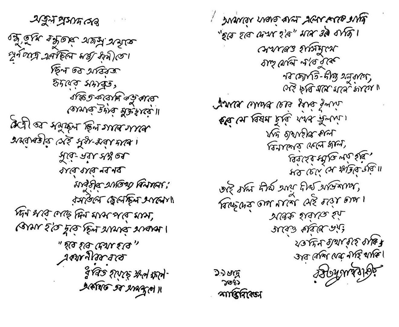
Rabindranath Tagore tribute page (1934)
1934Neatness 89 / 100 (Very neat) · Slant +0° · 20 lines
Upright · wide · printed
Rabindranath Tagore · Public domain · Wikimedia Commons · View full-size image
Compare five penmanship specimens on a 0–100 scale, then see where 15 famous manuscripts fall in the rankings.
Rabindranath Tagore · Public domain · Wikimedia Commons · View full-size image
Enter the width of the photographed area to include letter size in your type.
Weakest: Left margin — circled on your page
Left margin: Start every line at the same left edge; a faint pencil line helps.
Neatness 89 / 100 (Very neat) · Slant +0° · 20 lines
Upright · wide · printed
Rabindranath Tagore · Public domain · Wikimedia Commons · View full-size image
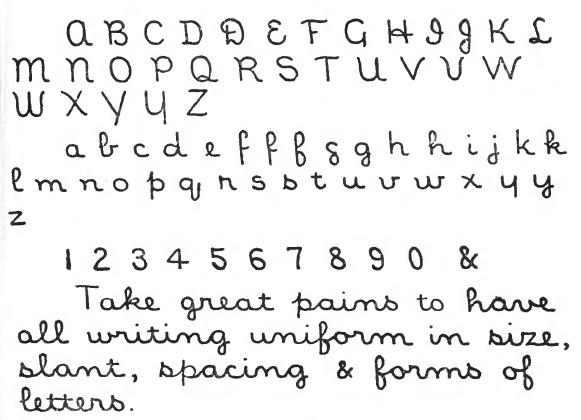
Neatness 87 / 100 (Very neat) · Slant +0° · 9 lines
Upright · wide · printed
John Cotton Dana · Public domain · Wikimedia Commons · View full-size image
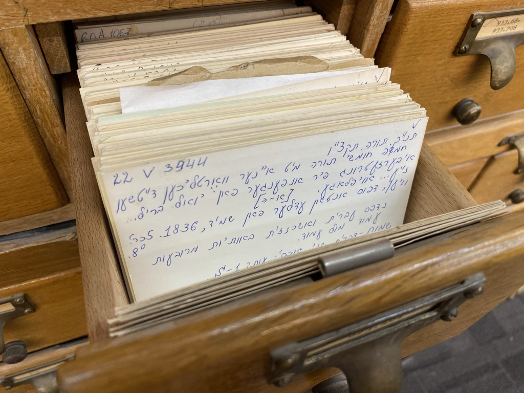
Neatness 86 / 100 (Very neat) · Slant +2° · 2 lines
Upright · wide · printed
Saifunny · CC BY-SA 4.0 · Wikimedia Commons · View full-size image
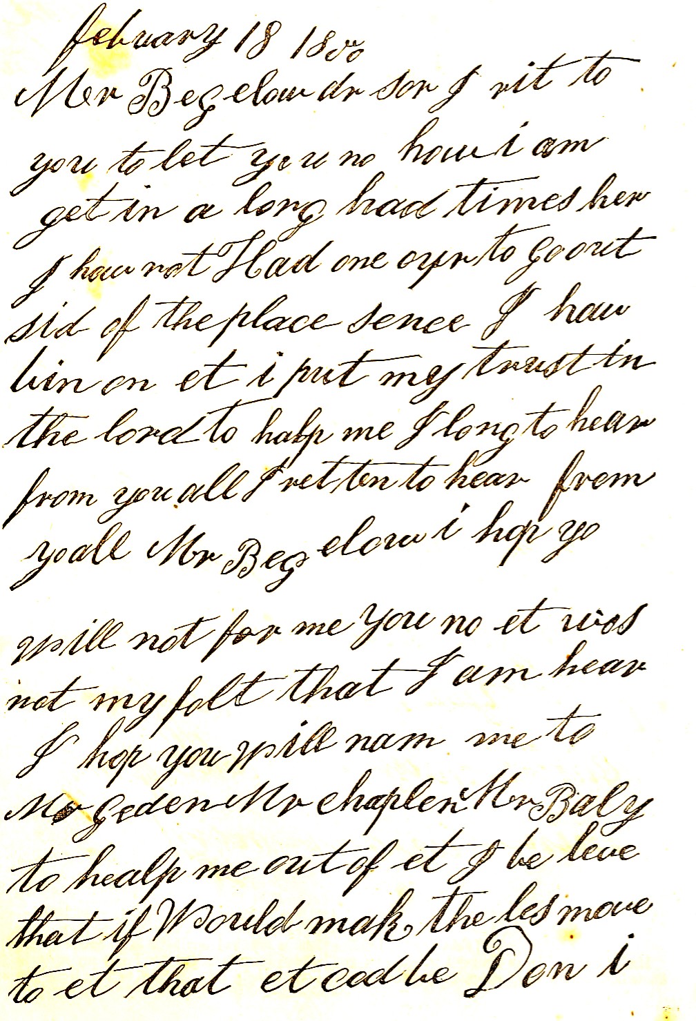
Neatness 83 / 100 (Neat) · Slant +42° · 19 lines
Forward · close · printed
Harriet Beecher Stowe · Public domain · Wikimedia Commons · View full-size image
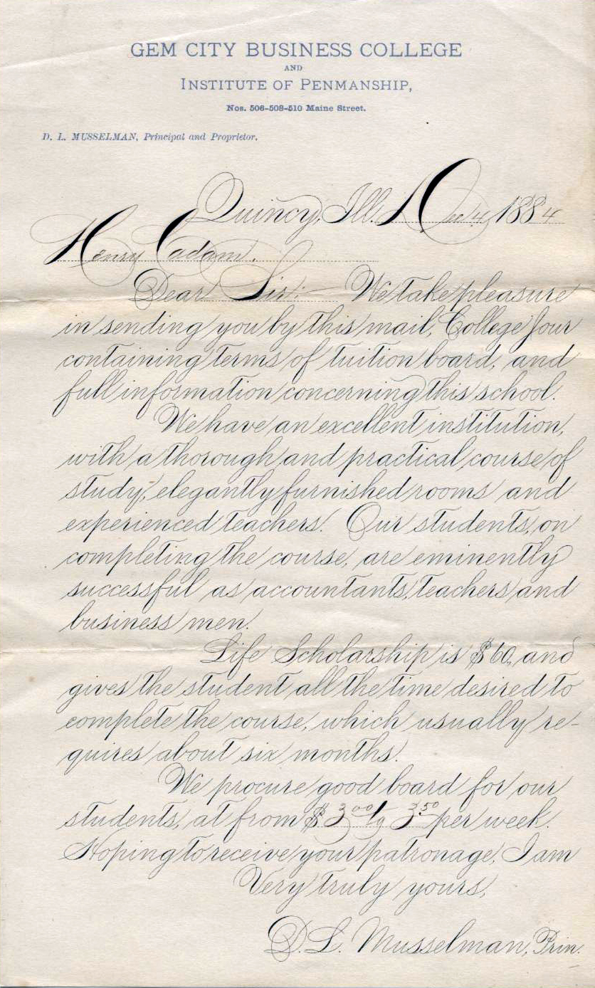
Neatness 67 / 100 (Readable, uneven) · Slant +42° · 19 lines
Forward · wide · printed
D. L. Musselman · Public domain · Wikimedia Commons · View full-size image
The 0–100 neatness score measures how consistent a sample is from word to word and line to line: steady small-letter height, low baseline wobble, even gaps between words and lines, a straight left margin, and one repeatable slant angle.
Formal 19th-century display calligraphy like Spencerian script uses sweeping capital flourishes and steep 42° forward strokes that widen size and slant spread, whereas uniform library-catalog script keeps every lowercase body nearly identical.
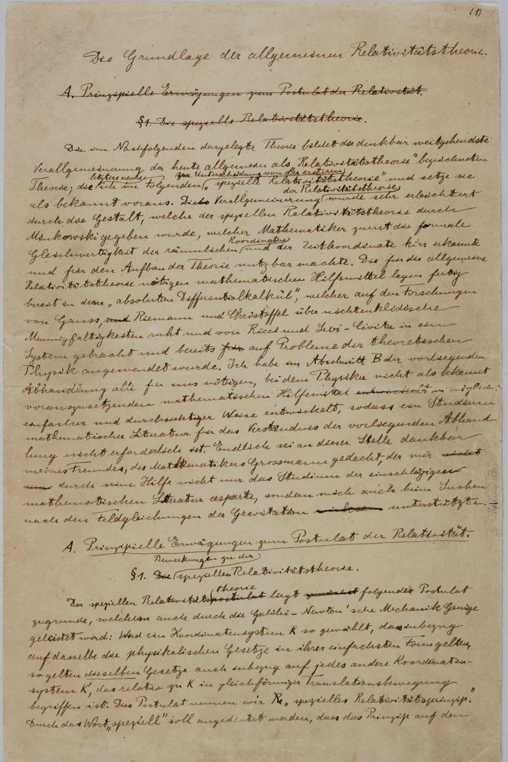
Slant +29° · Size 8 px · Neatness 77
The Foundation of the General Theory of Relativity manuscript, page 1 (1916)
Forward · wide · printed
Albert Einstein · Public domain · Wikimedia Commons · View full-size image
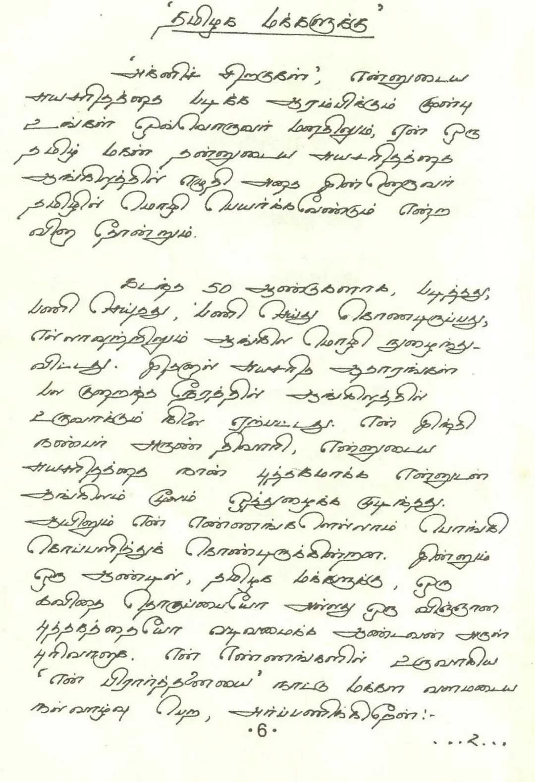
Slant +42° · Size 11 px · Neatness 95
Handwritten Tamil foreword “To the Tamil people” for the Tamil edition of Wings of Fire, page 6
Forward · wide · connected
A. P. J. Abdul Kalam · GoTamil · View full-size image
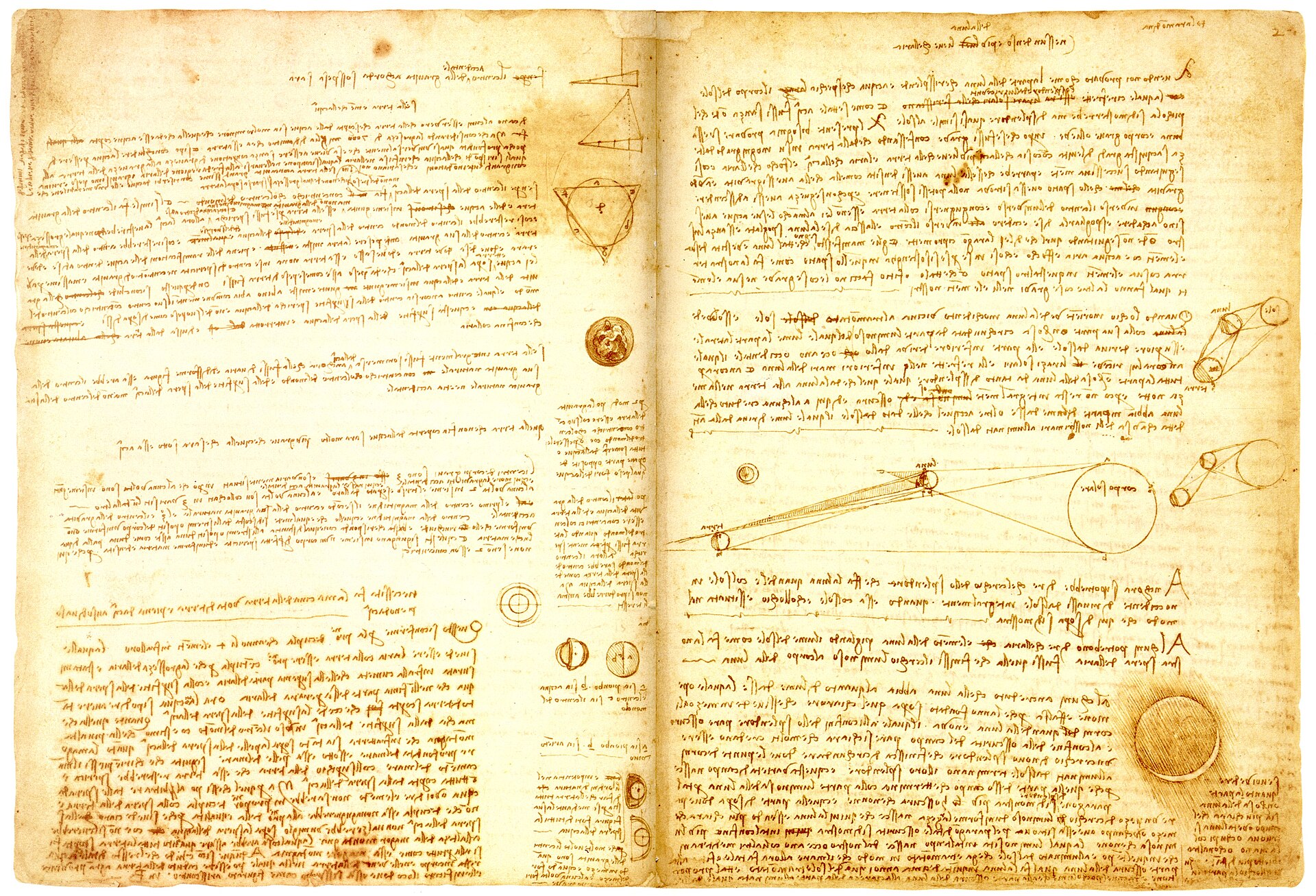
Slant +0° · Size 4 px · Neatness 40
Codex Leicester, Hammer 2A, fol. 35v and 2r (c. 1506–1510, measured from horizontally flipped copy)
Upright · wide · printed
Leonardo da Vinci · Public domain · Wikimedia Commons · View full-size image
Slant +0° · Size 18 px · Neatness 89
Handwritten tribute to Atul Prasad Sen (1934)
Upright · wide · printed
Rabindranath Tagore · Public domain · Wikimedia Commons · View full-size image
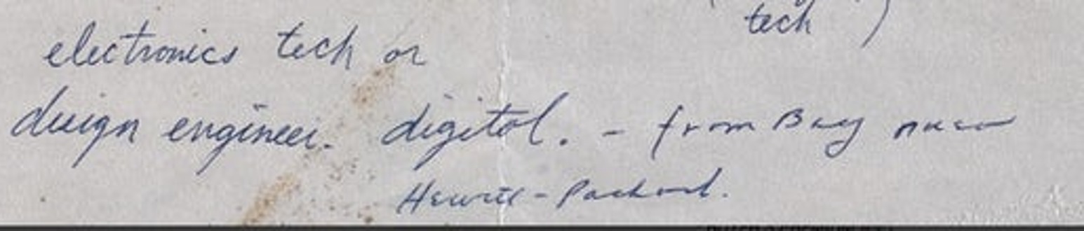
Slant +35° · Size 16 px · Neatness 73
1973 job application, handwritten answers (Special abilities and Interests)
Forward · wide · printed
Steve Jobs · Reed Magazine · View full-size image
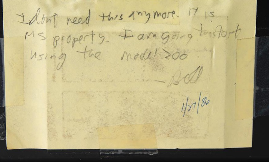
Slant +1° · Size 6 px · Neatness 73
Note signed “Bill”, 27 January 1986, taped to his TRS-80 Model 100
Upright · wide · printed
Bill Gates · RR Auction · View full-size image
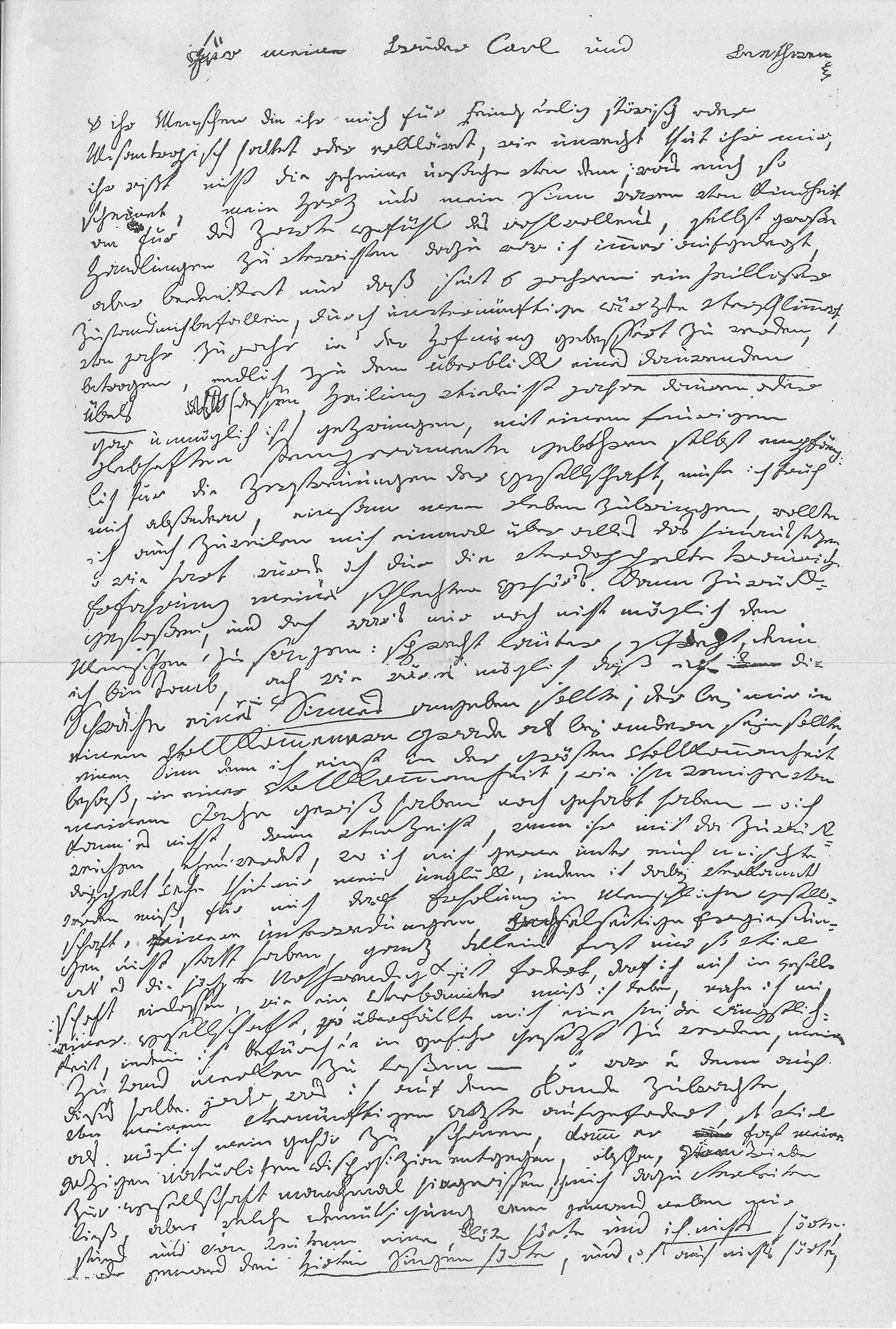
Slant +0° · Size 5 px · Neatness 43
Heiligenstadt Testament, page 1 facsimile (1802)
Upright · wide · printed
Ludwig van Beethoven · Public domain · Wikimedia Commons · View full-size image
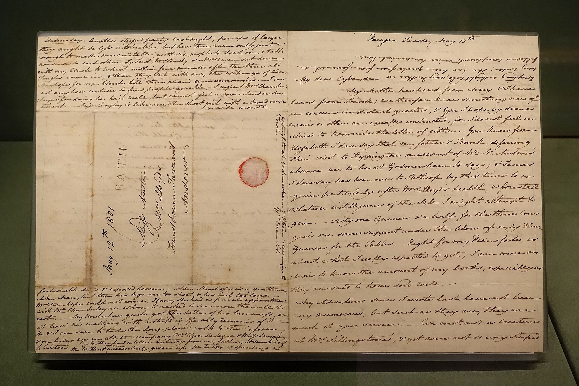
Slant +0° · Size 4 px · Neatness 49
Letter to Cassandra Austen, Bath (1801)
Upright · wide · printed
Daderot · Public domain · Wikimedia Commons · View full-size image
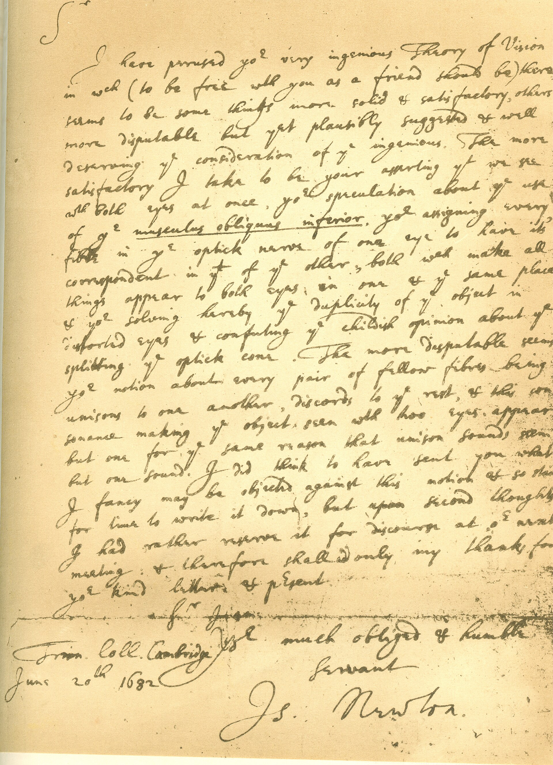
Slant +34° · Size 9 px · Neatness 69
Letter to Dr. William Briggs on A New Theory of Vision (1682)
Forward · wide · connected
Xtrasystole · CC BY-SA 3.0 · Wikimedia Commons · View full-size image
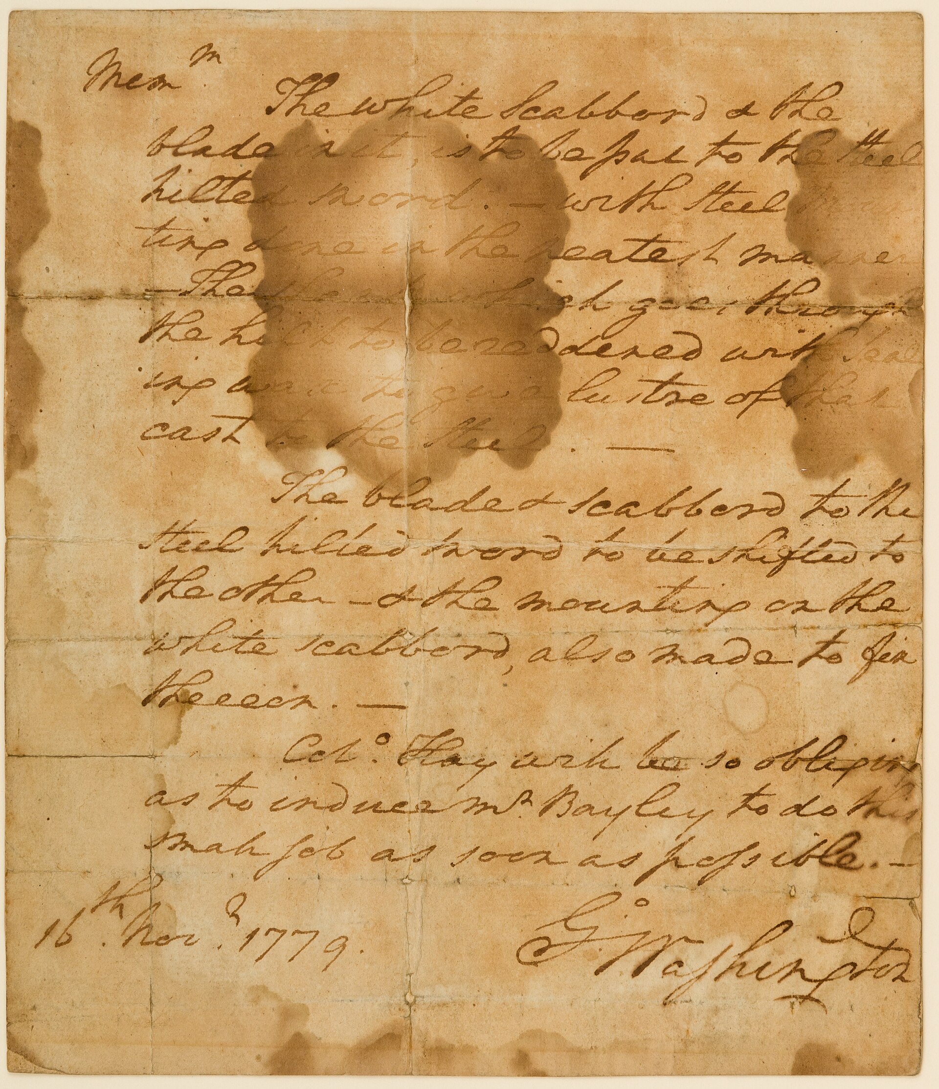
Slant +41° · Size 15 px · Neatness 79
Memorandum describing work to be done on his swords (1779)
Forward · wide · printed
Metropolitan Museum of Art · CC0 · Wikimedia Commons · View full-size image
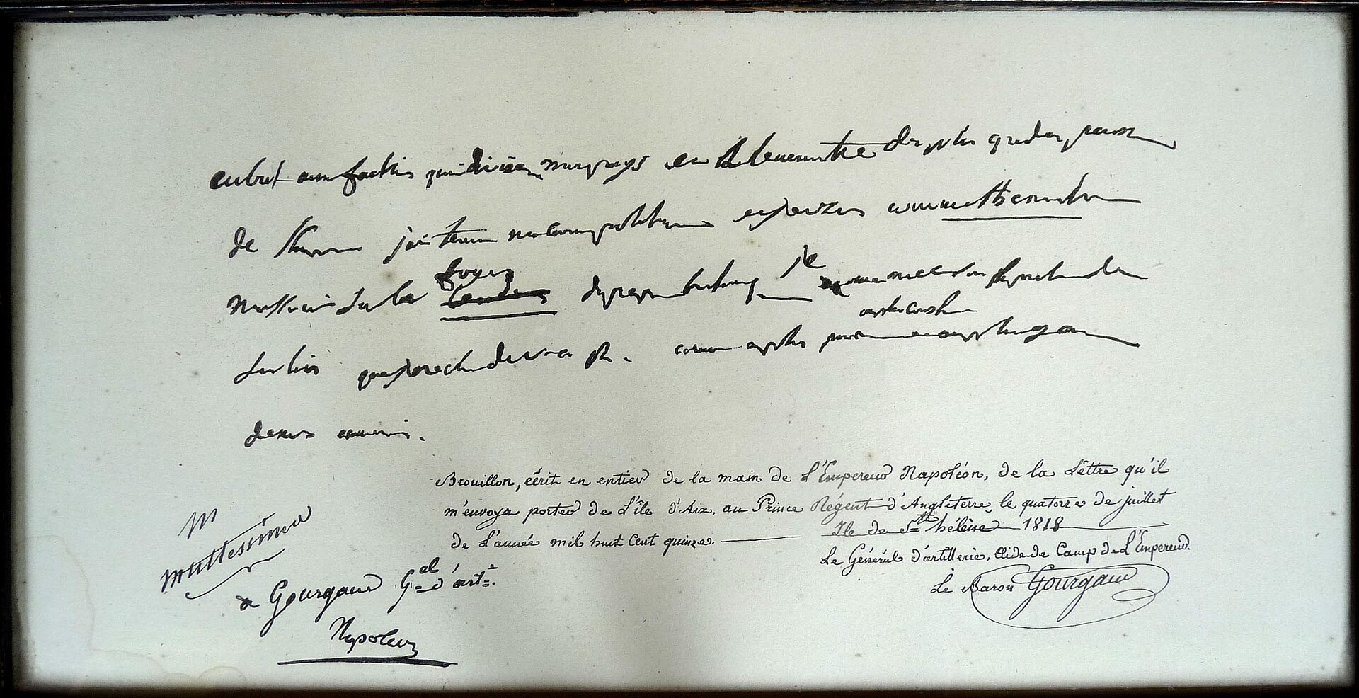
Slant +34° · Size 8 px · Neatness 54
Autograph draft of the letter to the Prince Regent (1815)
Forward · wide · connected
Ji-Elle · CC BY-SA 3.0 · Wikimedia Commons · View full-size image
Slant +0° · Size 6 px · Neatness 40
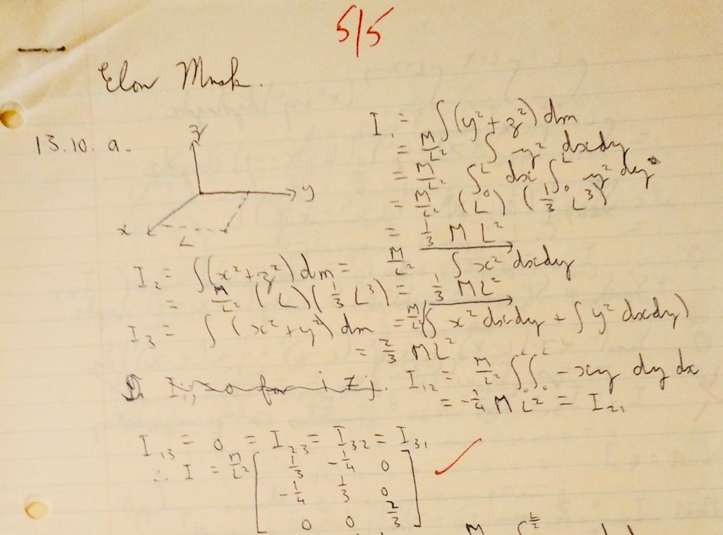
College physics homework (moments of inertia), shared by Musk on X in 2020
Upright · wide · printed
Elon Musk · X · View full-size image
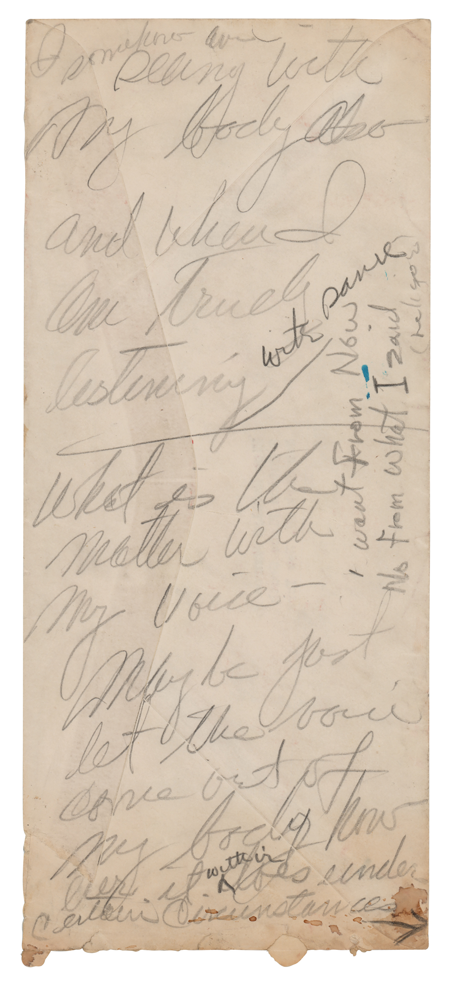
Slant +0° · Size 7 px · Neatness 38
Acting notes in pencil on an envelope addressed to her at 2 Sutton Place South, New York
Upright · wide · printed
Marilyn Monroe · RR Auction · View full-size image
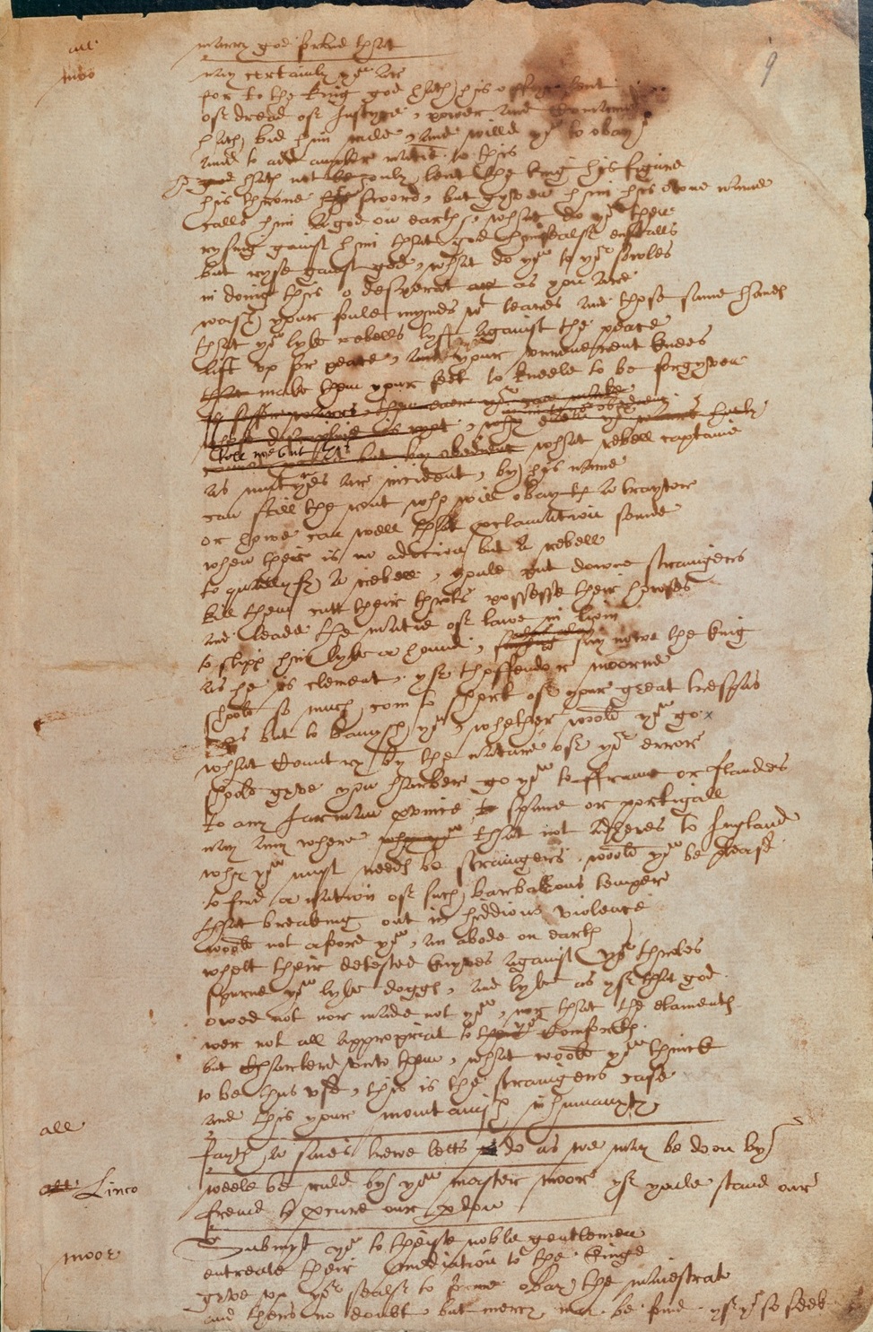
Slant +0° · Size 7 px · Neatness 69
Sir Thomas More, Hand D manuscript page (c. 1590s–1600s)
Upright · wide · printed
Unknown author · Public domain · Wikimedia Commons · View full-size image
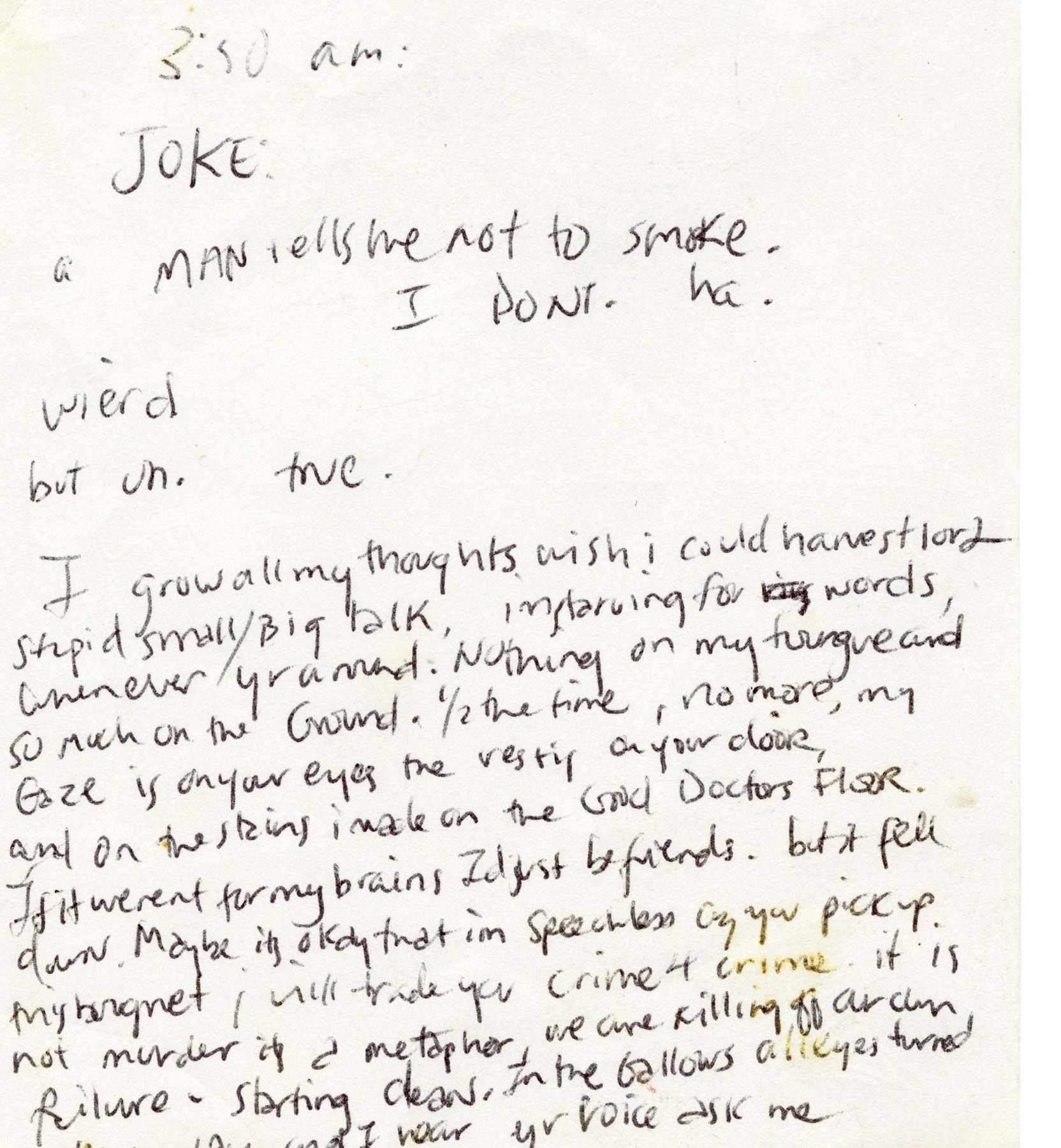
Slant +0° · Size 20 px · Neatness 83
Handwritten notes and lyrics on a Cataflam notepad page
Upright · wide · printed
Kurt Cobain · Joopiter · View full-size image
| A. P. J. Abdul Kalam | 95 / 100 | +42° | 11 px | Forward · wide · connected |
| Rabindranath Tagore | 89 / 100 | +0° | 18 px | Upright · wide · printed |
| Kurt Cobain | 83 / 100 | +0° | 20 px | Upright · wide · printed |
| George Washington | 79 / 100 | +41° | 15 px | Forward · wide · printed |
| Albert Einstein | 77 / 100 | +29° | 8 px | Forward · wide · printed |
| Steve Jobs | 73 / 100 | +35° | 16 px | Forward · wide · printed |
| Bill Gates | 73 / 100 | +1° | 6 px | Upright · wide · printed |
| William Shakespeare | 69 / 100 | +0° | 7 px | Upright · wide · printed |
| Isaac Newton | 69 / 100 | +34° | 9 px | Forward · wide · connected |
| Napoleon Bonaparte | 54 / 100 | +34° | 8 px | Forward · wide · connected |
| Jane Austen | 49 / 100 | +0° | 4 px | Upright · wide · printed |
| Ludwig van Beethoven | 43 / 100 | +0° | 5 px | Upright · wide · printed |
| Leonardo da Vinci | 40 / 100 | +0° | 4 px | Upright · wide · printed |
| Elon Musk | 40 / 100 | +0° | 6 px | Upright · wide · printed |
| Marilyn Monroe | 38 / 100 | +0° | 7 px | Upright · wide · printed |
Neatness has little to do with fame or century. The top three are A. P. J. Abdul Kalam’s handwritten foreword (95), Rabindranath Tagore’s 1934 tribute (89) and a notepad page by Kurt Cobain (83). The bottom of the table is made of working pages: Leonardo da Vinci’s notebook and Elon Musk’s homework (both 40) and Marilyn Monroe’s acting notes (38), where formulas, drawings and quick jottings break the lines apart.
Slant does not decide it. Six writers lean forward, from Einstein’s +29° to Kalam’s +42°, and nine write upright; the two neatest pages sit on either side. What separates the top from the bottom is the layout of the page: the lowest pages lose most of their points on line spacing, the left margin and a wandering baseline.
Related: Handwriting test · Rate my handwriting · Famous handwriting · Exam handwriting
Consistent small-letter height, a steady baseline, uniform word gaps and one repeatable slant angle across every line.
Scores of 85 or higher are rated Very neat, 70 to 84 Neat, and 50 to 69 Readable, uneven.
Flourishes, decorative capitals and mixed slant angles widen the letter-size and slant spread, whereas uniform library script keeps every word nearly identical.
Drop a photo of your own lined or plain page into the analyzer above or write on screen to get your 0–100 neatness score side by side.


