Handwriting samples
Choose a letter, note or exam answer to see the lines behind its score. A signed letter also shows how the writer changes scale at the close.
Closing page of a letter dated July 5, 1856, including her signature. Florence Nightingale / Wellcome Collection · CC BY 4.0 · Wikimedia Commons · View full-size image

Forward · wide · printed
Neatness 79 / 100The sample’s downstrokes lean 43° to the right of vertical (strong forward); across 37 words the middle half sit within 1°.
Graphology reads this as: Graphologists read a strong forward slant as a hand that moves toward people and goals: responsive, quick to react, carried by enthusiasm.
The sample’s lowercase letter bodies are about 22 pixels tall in this image.
Graphology reads this as: Graphology reads letter size alongside spacing, slant and regularity.
The sample’s lines run gently rising overall (+1.2°): 9 of 13 lines rise, 4 fall. Along each line the writing stays within 8% of a letter's height of a straight line (very steady).
Graphology reads this as: Rising lines are traditionally read as optimism and drive: energy that lifts as the writing continues. A line this steady is read as self-control.
The gap between words in the sample is about 3.3 times the lowercase body height.
Graphology reads this as: Wide word spacing is traditionally read as a need for room: independence, clear thinking, a little distance from others.
Lines sit 5.0 body-letter heights apart. The writing starts 7% from the left edge and uses 100% of the page height.
Graphology reads this as: Generous line spacing is traditionally read as a need for clarity and order; writing right up to the left edge as wanting to get started without ceremony.
About 0.42 pen lifts per letter: most letters are printed, with some joined pairs.
Graphology reads this as: A print-script mix is traditionally read as a practical thinker who joins ideas when it helps and breaks them when it doesn't: speed and clarity both matter.
Ascenders reach 1.5× the core height and descenders drop 1.5×: the lower zone dominates.
Graphology reads this as: A dominant lower zone is traditionally read as physical energy, the material and the instinctive.
The median ink width is 2.7 pixels (0.12× letter height). From a photo we measure ink width rather than pen pressure.
Graphology reads this as: Medium stroke weight is traditionally read as steady, everyday energy.
Compare the specimens
| Specimen | Slant | Neatness | Measured type |
|---|---|---|---|
| 43° | 79 / 100 | Forward · wide · printed | |
| 1° | 73 / 100 | Upright · wide · printed | |
| 0° | 99 / 100 | Upright · wide · printed | |
| 41° | 79 / 100 | Forward · wide · printed |
What makes a good handwriting sample?
Pick three or four lines written at your usual pace. Include the start and end of each line. A shopping list reveals the shapes of individual words, but a paragraph gives a better view of spacing and alignment.
A signature beside ordinary writing
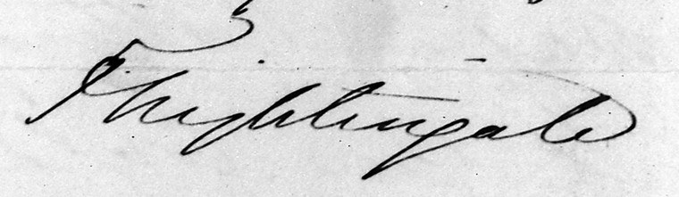
Follow Nightingale’s last lines into her signature. The name has more space to travel across the sheet than a word inside a sentence. For a signature on its own, crop to the name and use the signature test.
Questions
Which example should I compare with a notebook page?
Start with the working note. Its short entries leave different gaps from a continuous letter or a timed exam answer.
Can two very different hands get the same score?
Yes. Upright print and sloping cursive can both keep a steady baseline and even gaps.
How can I compare physical letter size?
Photograph the full width of the sheet and enter its width in millimetres. Pixel heights alone depend on the crop.